Sunday, 26 January 2014

Attempt at final front cover

I asked my audience out of all the front covers I had done so far which one they thought looked the best and the most professional, they agreed they thought this front cover was more appropriate because you could see the main object clearly and a lot of the conventions are shown clearly on this front cover. ...


Friday, 17 January 2014

Mock ups

This is an attempt of my magazine front cover, I dont think this cover is very good so far. I think the writing as the coverlines are too close together which will make it difficult to read. I also think that this front cover lacks text and looks very plan and boring, as my first attempt I think it is very interesting however there is a lot of room for improvement.
For example adding more text, having a better pull quote that stands out and making the front cover more unique. 
With this front cover I liked the photograph a lot I think it looks interesting but again with this front cover it lacks coverlines and information to improve this magazine I would liked to add more text, use a pull quote and make space between the coverlines,

Monday, 6 January 2014

What I need to do next

Next after I have finished editing and choose he photo i want to use as my front cover I need to consider what headlines and cover lines I should use that match/fit my subjects image.
Using featured articles would be good, because the article could be focused on the main subject on the ront cover. This would be good when considering my double paged spread.

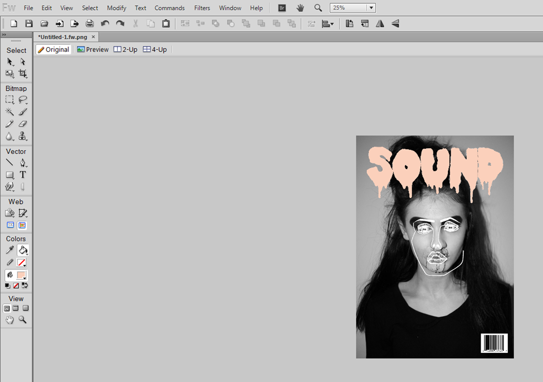
I want my headline to be short/very one worded but to mean/say a lot for example again i-D magazine:
.
"Graceful" very short but again makes the page look full because of the focused image. I like magazines that have little text on the front cover I think it makes the magazine have a cutting edge and makes costumers more interested in what the issue entails

Friday, 3 January 2014

experimenting with photo

I used fireworks to edit the brightness on the photo, when making the image brighter it allows the colours to become more noticeable making the image stand out and look more interesting. In this image it made the subjects eye's stand out which made the photo look more significant and bold.
Again using fireworks I adjusted the saturation of this image by doing this it made the image look slightly black and white giving the idea it was an older photo, I tried using this to make the front cover look more unique making the images look different.
Then in this I started to make the magazine look more realistic by adding the masthead and the bar-code to see what the finishing product may look like, I like this attempt because it looks more natural and young. The masthead looks interesting and matches well with the photo I have chosen because the neutral coordinate.  

I tried changing the curves in the image that adjusted the colour/lighting, I only slightly moved the curves because the photo dramaticly changed when only slightly changing the curves, the images can be come washed out or to vibrant depending on which way the line bends to, making sure the image doesn't look to edited is important.  


this image is very different because I inverted the colours which made the photograph look like this, if this was to be a front cover image it would stand out, the image looks weird and interesting which I like however I don't know if its appropriate to have as the main focused image.

Then finally I used black and white, I like this because it's simple and makes the masthead stand out and look exaggerated. This layout of front cover comes very similar to dazed and confused magazine because the masthead is very large but the image is dramatic and centre of attention.

experimenting with fireworks and photo editing websites I have produced this: